The desire to improve the presentation of content from the sciences and the arts to develop the Mundus maris website into a functional and attractive platform for international cooperation for sustainable seas and a resource for interested people from different horizons led to the project to create a corporate identify for the Initiative. Carla Zickfeld, member of the Initiative and Coordinator of Progetto Tuscia, made the initial suggestion, which was welcomed by the members.
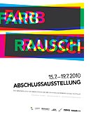 Starting in September 2009, three students of the Johannes-Gutenberg-Schule Stuttgart, Zentrum für Druck, Kommunikation und Design, Germany, in their final year of communication studies were tasked to develop a visual presentation of the Initiative. The six-months course work was conducted under the academic supervision of Rainer Leippold and two other professors of the Johannes-Gutenberg-Schule, while Carla Zickfeld ensured the coordination.
The three students received inputs about the Initiative in the form of a questionnaire/profile and information materials about the Initiiative as well as further guidance from Carla Zickfeld and Rainer Leippold. In December 2009, the three students, Susi Eisele, Tatjana Rotfuss and Nadine Smola submitted three design ideas, to provide some insights into the development process. They meanwhile completed their academic assignment in the form of a complete portfolio composed of logo, business cards, stationary, a flyer for presenting the Initiative and a web design.
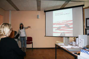
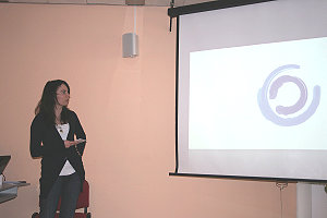
Their results have been publicly presented in Stuttgart on 5 February 2010. Another public presentation took place in Brussels by the young designers themselves in the occasion of a lunch debate at the Free University of Brussels (ULB). The portfolios have been assessed by an international jury. As a result, the Initiative expects to be able to improve its graphical presentation soon. The following pages are intended to recognise all three proposals. Read on to see summaries of the proposals.
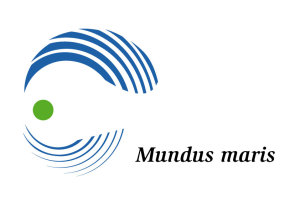 Tatjana's basic consideration in creating the logo and corporate identity graphics was that there is no life on earth without water and the oceans. When the sea around us is in good shape, then our planet is as well. Therefore, she put the sea represented by blue waves into the most prominent position in the logo. The sea envelopes the healthy, green earth. It has a protective function for our earth. We humans, with the impact we now have on even remote corners of our planet, must in turn protect the sea.
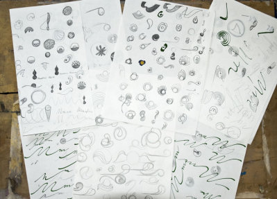
To get there had been quite a journey of trial and error in exploring forms and character sets that would fit together and convey the key message she wished to get across and at the same time leave room for the phantasy of viewers to find their own individual association with the logo.
 |
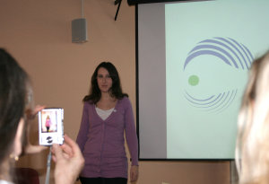 |
From the thematic exploration through many sketches to a professional presentation of the finished look....
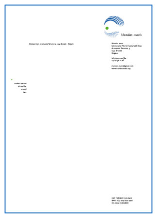
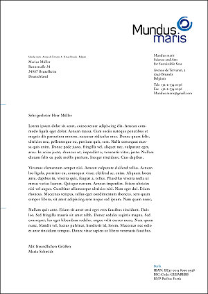
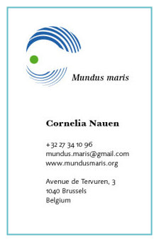 Of the wide range of components of the portfolio we show only the basic stationary below and the visiting card to the left (natural proportions not respected in the display). But there are also pick-up cards, a flyer, a mouse pad, button, games for children, a T-shirt, labels for different types of envelopes, a logo application for cars or the entry door of an office or external window, suggestions for improving the website and much more.
Should you get a letter from the Initiative, expect it to come on this stationary.
 The poll among members of the Initiative led to the choice of this proposal because of the inspiring graphic presentation of Mundus maris. We whole-heartedly congra-tulate Tatjana for her excellent and very convincing proposal. We thank her and her tutors at the Johannes-Gutenberg Schule in Stuttgart for the rights to use the logo and comporate identity on our website and other applications.
We do hope that this logo will soon be well-established and well-known. We trust it will serve us in good stead in consoli-dating our presence on the web and in many activities in support of making our relations with the sea and the earth which we share more sustainable.
We wish Tatjana an excellent professional career and success in creating equally attractive solutions to integrating a cause for sustainability within a professional approach.
Susi's approach to the logo is a circle, a symbol of perfection, standing also for the most complete, for the Earth herself. The interruptions in the bottom part of the circle represent the imperction of conditions on our planet. The whale, here represented by it tail fin is not only an evocation of life below the surface of the oceans, but also of all creatures in need of protection.
The image has two parts. Above the horizon is what we can see and observe. Below the surface of the sea is a hidden world, we can only approach through study, but which remains hidden to most of us. The written part of the logo consisting of Mundus maris ensures a sense of unity and togetherness, of the type the Initiative represents and promotes.
 |
 |
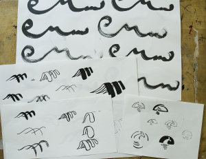
The long way from the exploratory sketches to the full-fletched portfolio presentation
 Susi prepared a complete portfolio with pick-up cards, folders, playing cards and other materials to catch the attention for activities of Mundus maris. Included were also T-shirts for kids and adults, a proposal for a flyer and a new look for the website. Even a button and stickers were proposed - in brief, an all-round graphical presentation of Mundus maris.
 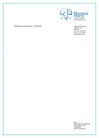 The logo sits well on the visiting card to the left and stationary to the right. The relative proportions are, of course, not realistic. To complete the stationary an envelope and package label already convey a flavour of the content.
It was hard to chose between the diffeent proposals. In the end, this and the next were in second place. The members of Mundus maris congratulate Susi Eisele and the Johannes-Gutenberg Schule in Stuttgart for the great work as well as the professionalism and care taken with the entire portfolio and thank them for their effort.
We much appreciated the engagement with the objectives and work of Mundus maris and are convinced that Susi will move on to a successful professional career that will remain steeped in concern for sustainable co-habitation on the one blue planet we have.
 Nadine's central idea in creating her proposal for the corporate identity of Mundus maris was two-pronged: she wanted to convey an artistic image of the oceans enveloping the Earth and representing the ever-moving waves in the associated script. The planet and the sea are both open to attack and vulnerable, yet protective of one another.
The execution with a paintbrush is intended to enhance the association with the 'rough edges' of nature on the one hand and of an artistic approach on the other.
The swing of the characters and the smooth contours and colour variations mimic the eternal interplay of the waves.
 |
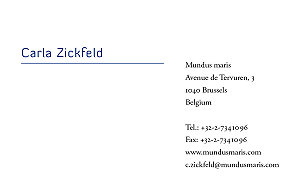 |
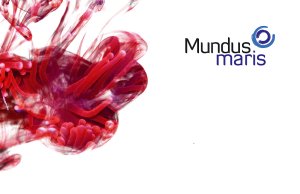
 Nadine's portfolio is characterised by a search for creative and uncommon images that could draw attention and stand out from the crowd and which she applies to its different components. A recurrent theme is the playful overlay of fragments of marine creatures, such as sea anemones and fishes living in community with corals, over coloured liquid dispersing haphazardly in transparent water. The effects and use of different vivid colours certainly stand out as can be seen on the back of the business card above. Next to it the more sober and functional front of the card with the name and contact details.
Other components of the portfolio include pick-up cards, stationary, note block, labels, flyer and proposed web design as well as other information and PR materials that could be used to make the Mundus maris Initiative and its activities known. Clearly, this is another coherent approach to the creation of a portfolio paying off the effort that went into all its parts.
The members of the Mundus maris Initiative congratulate Nadine Smola to her interesting solution and thank her and her tutors at the Johannes-Gutenberg Schule in Stuttgart for the excellent collaboration. We wish her every success in her next career steps after completing the final exams successfully.


